______________
Process
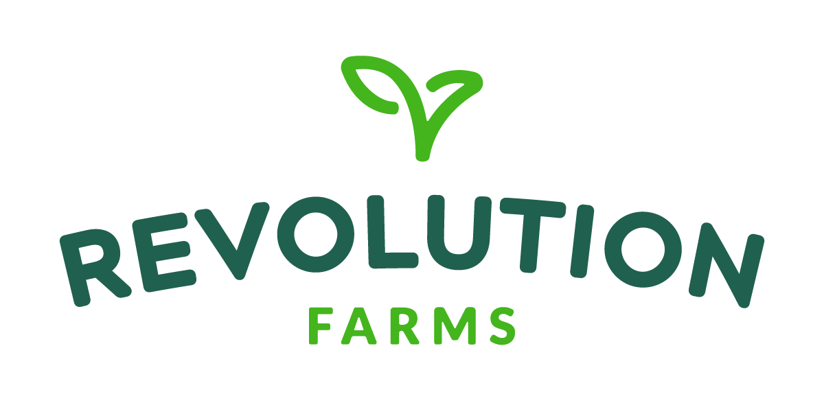
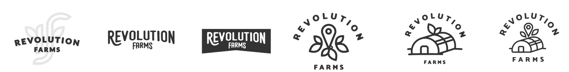
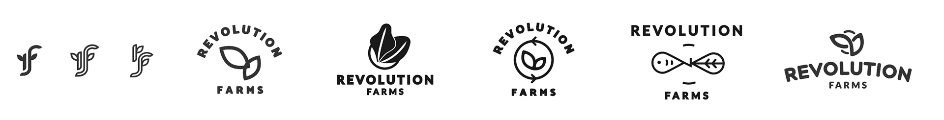
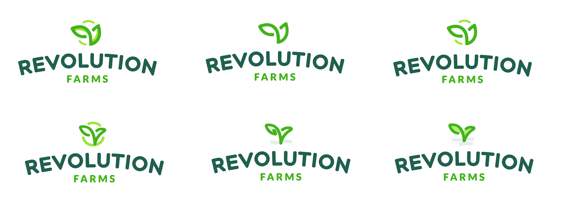
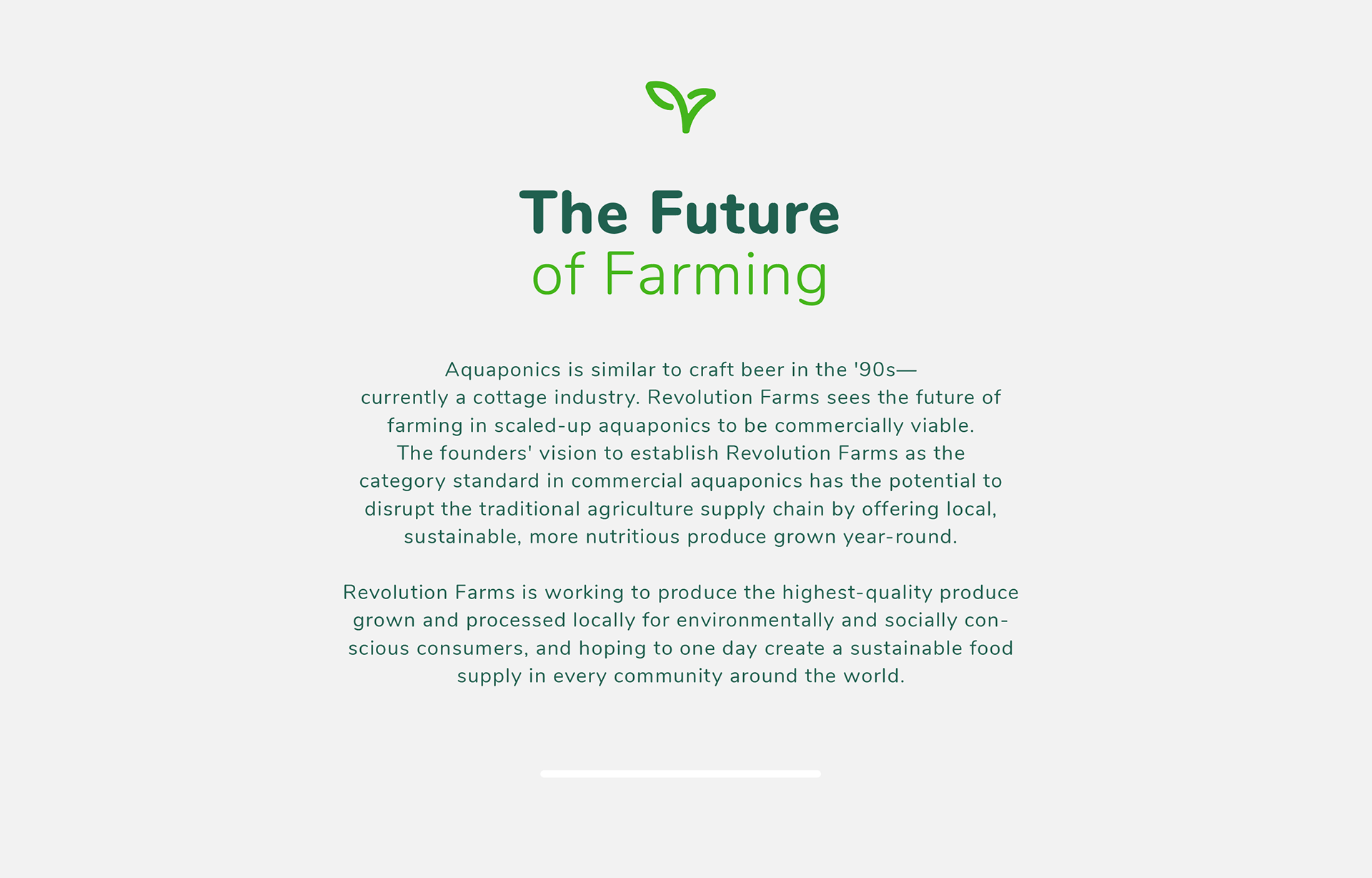
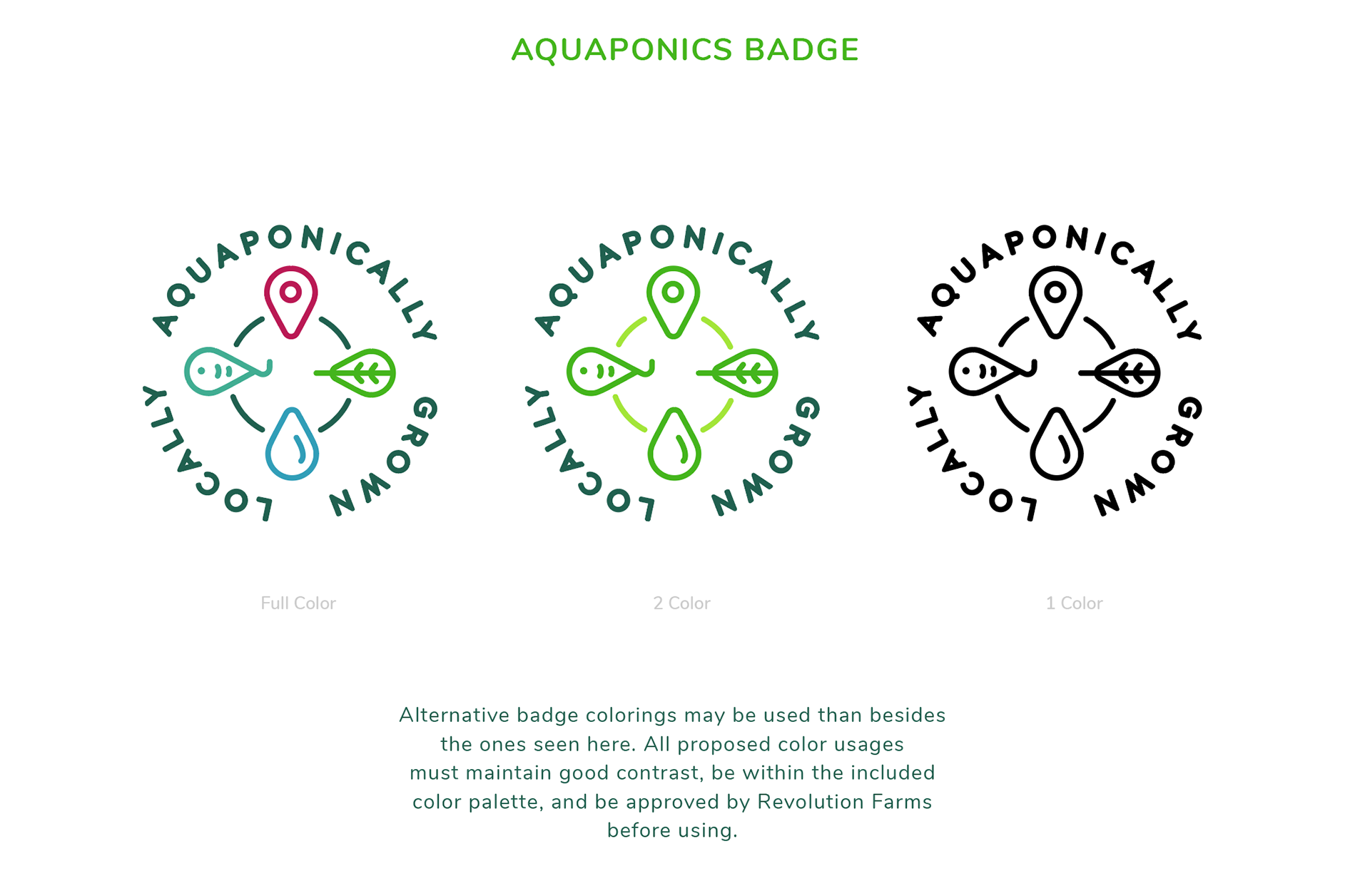
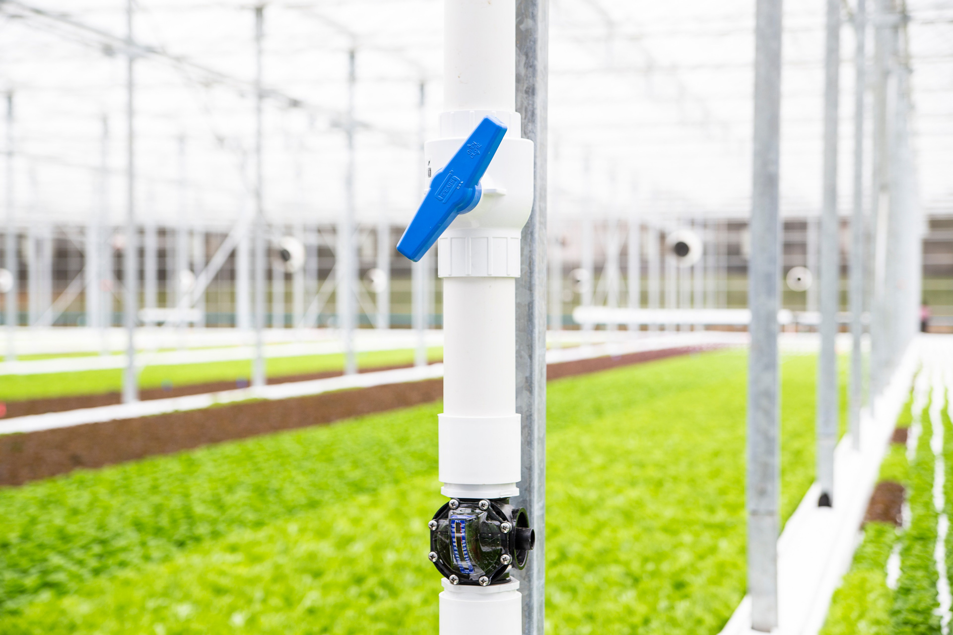
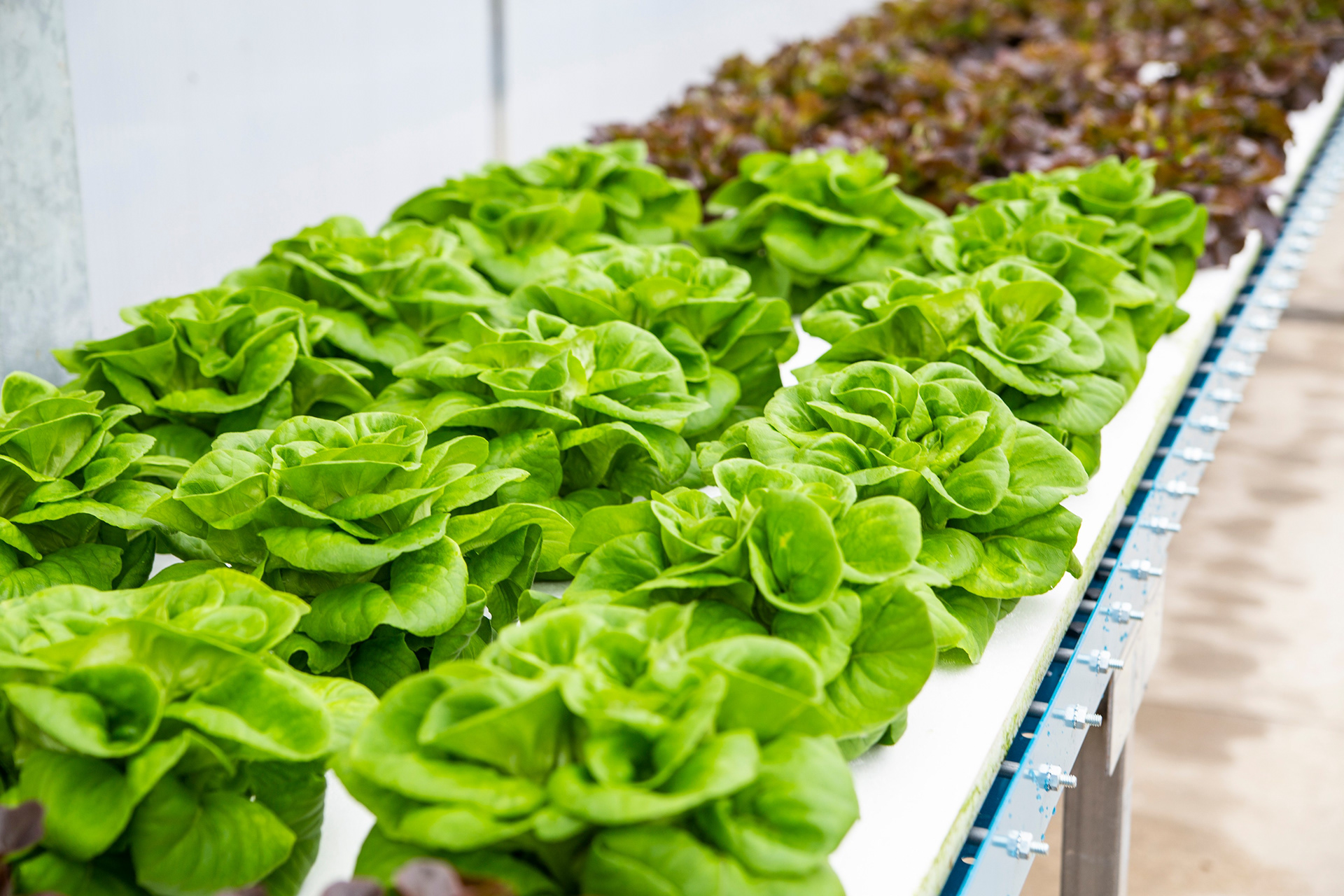
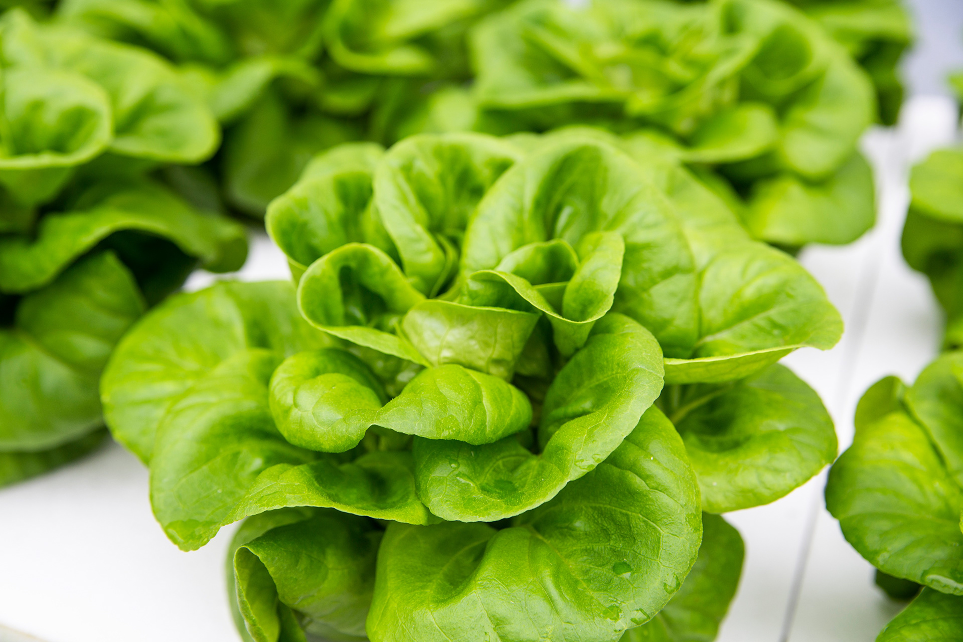
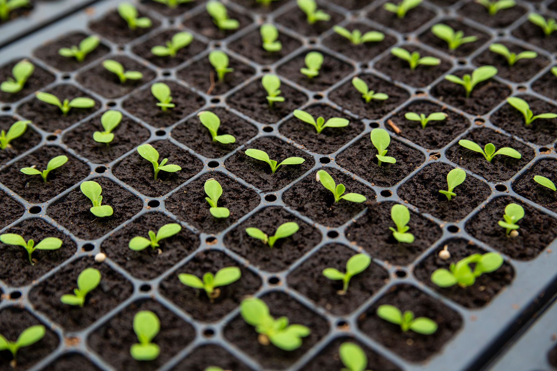
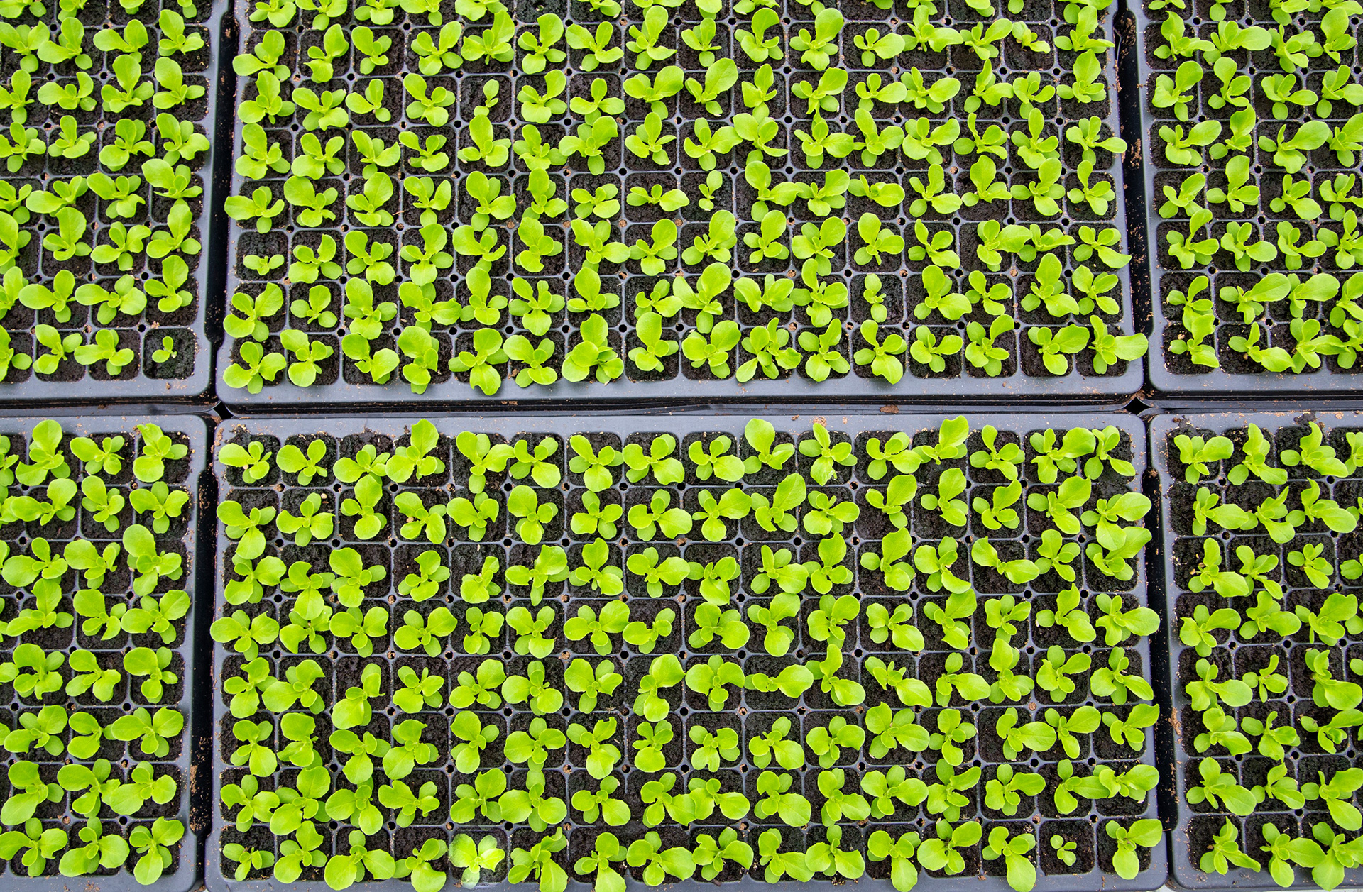
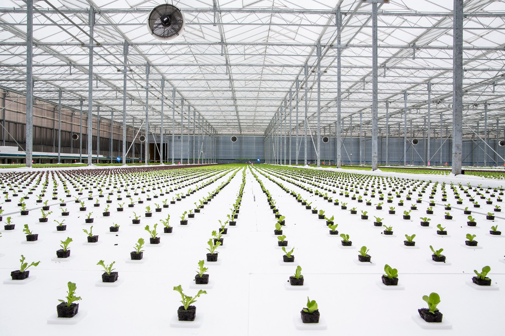
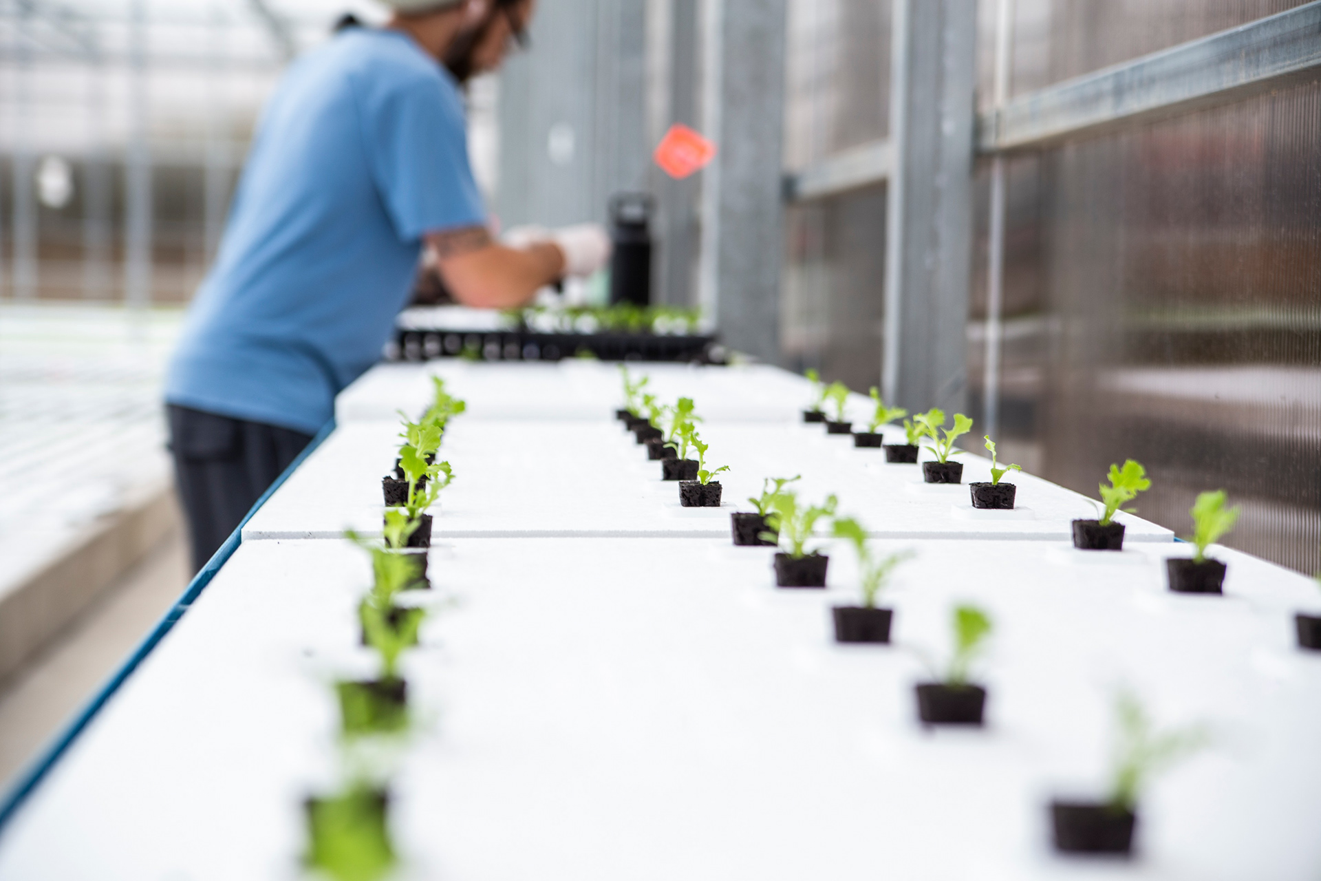
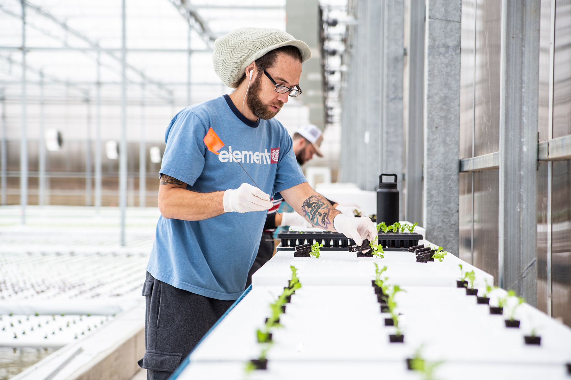
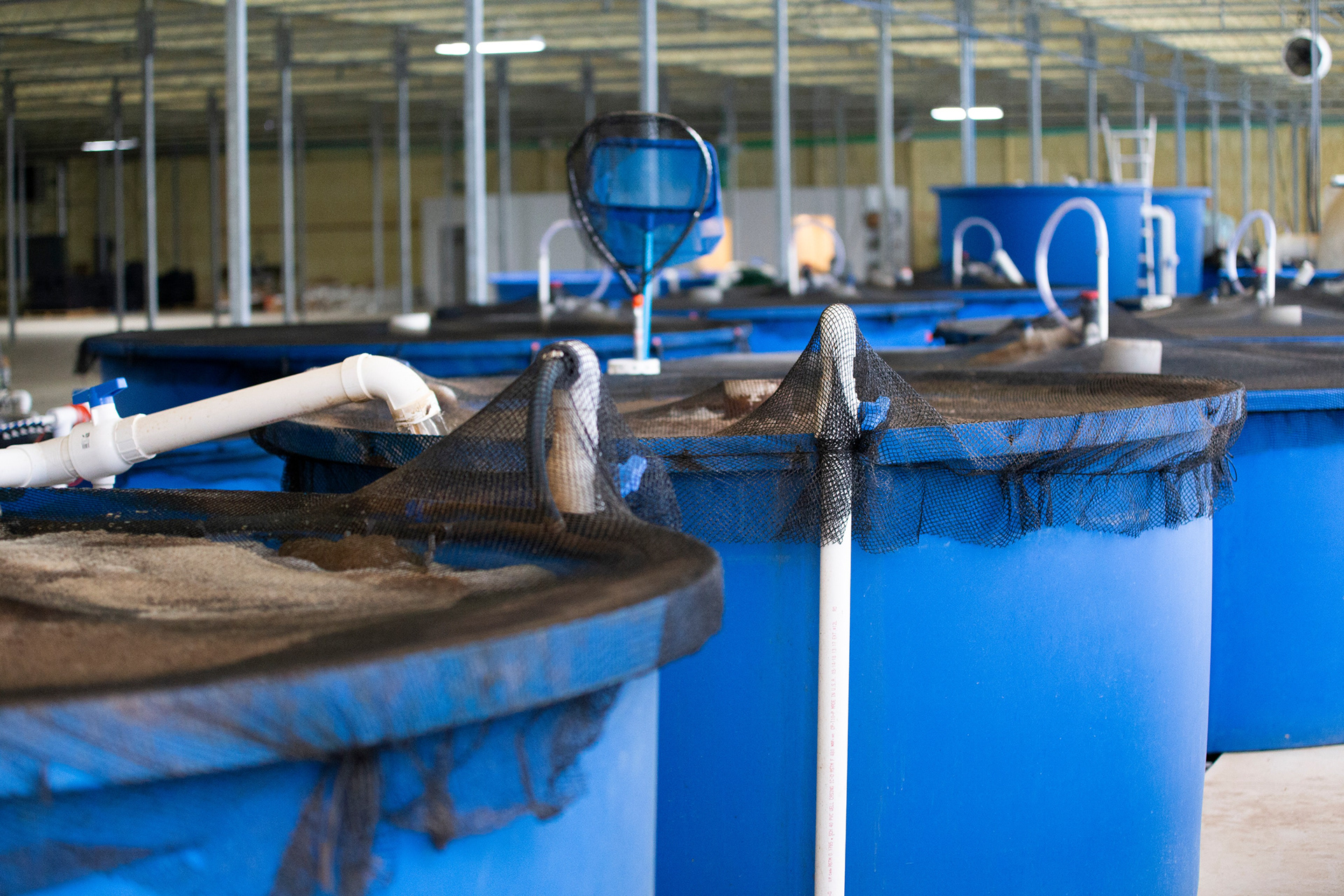
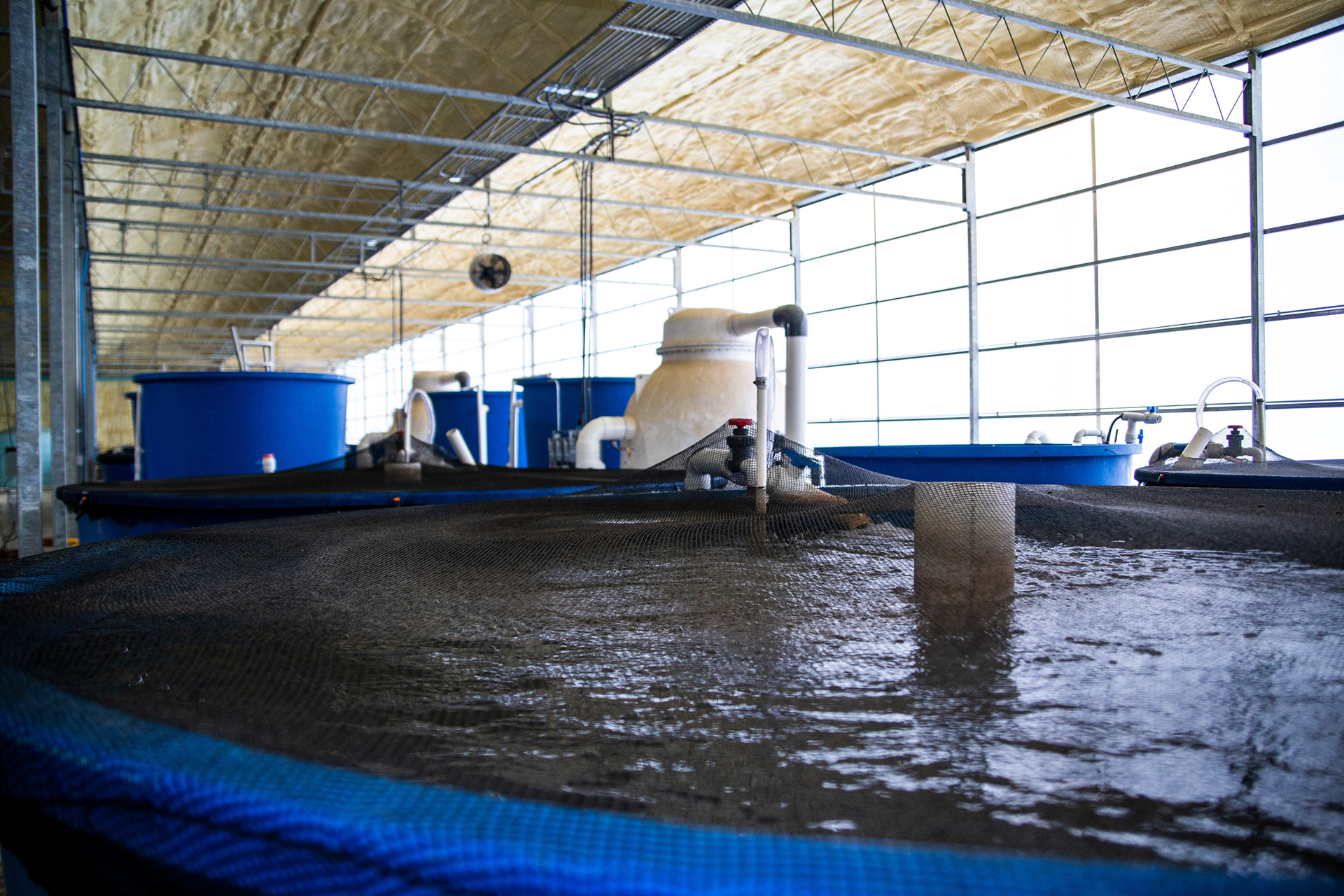
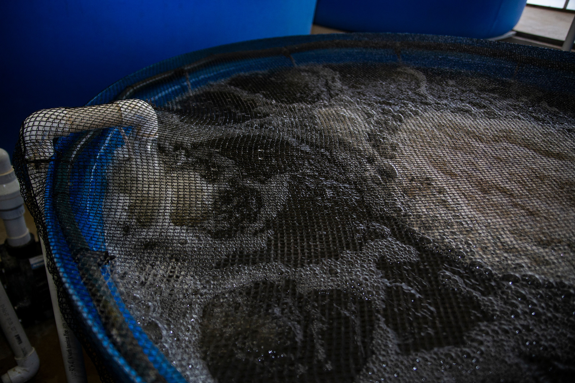
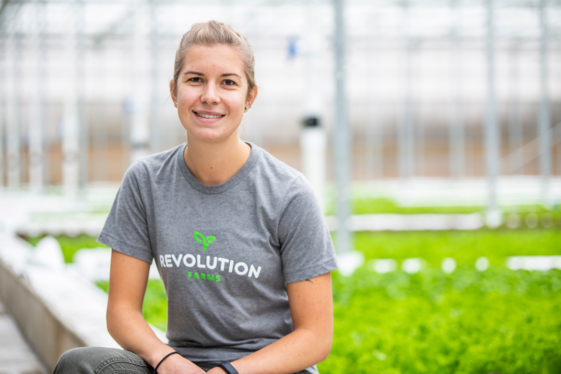
Crafting a brand for the aquaponics facility and produce product was an adventure led with a thorough ideation phase. The aquaponics process lends itself to iconography of water, fish, and renewable cycles. We wanted to marry these concepts with the Revolution Farms product itself, - fresh, local, sustainably grown lettuce.
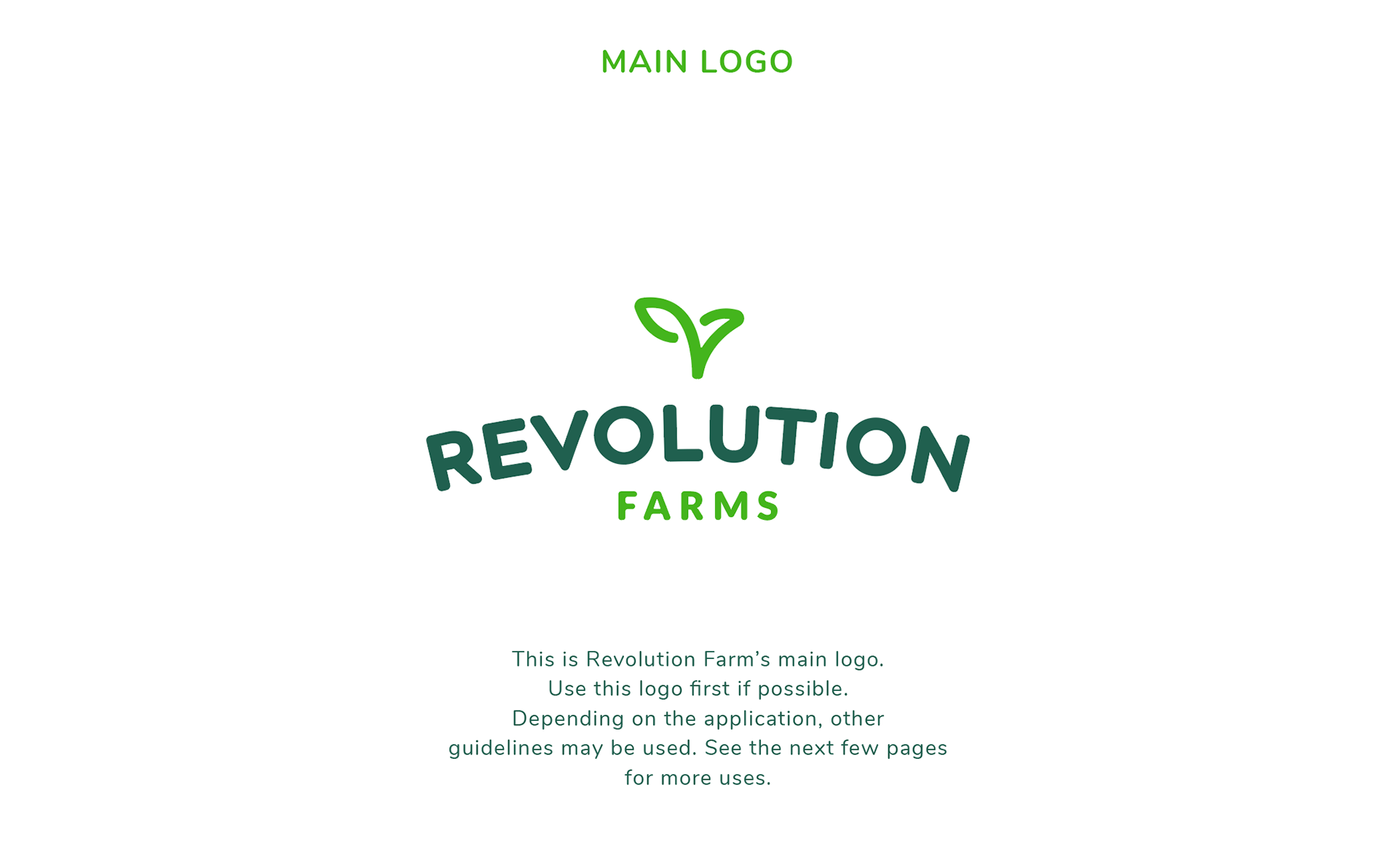
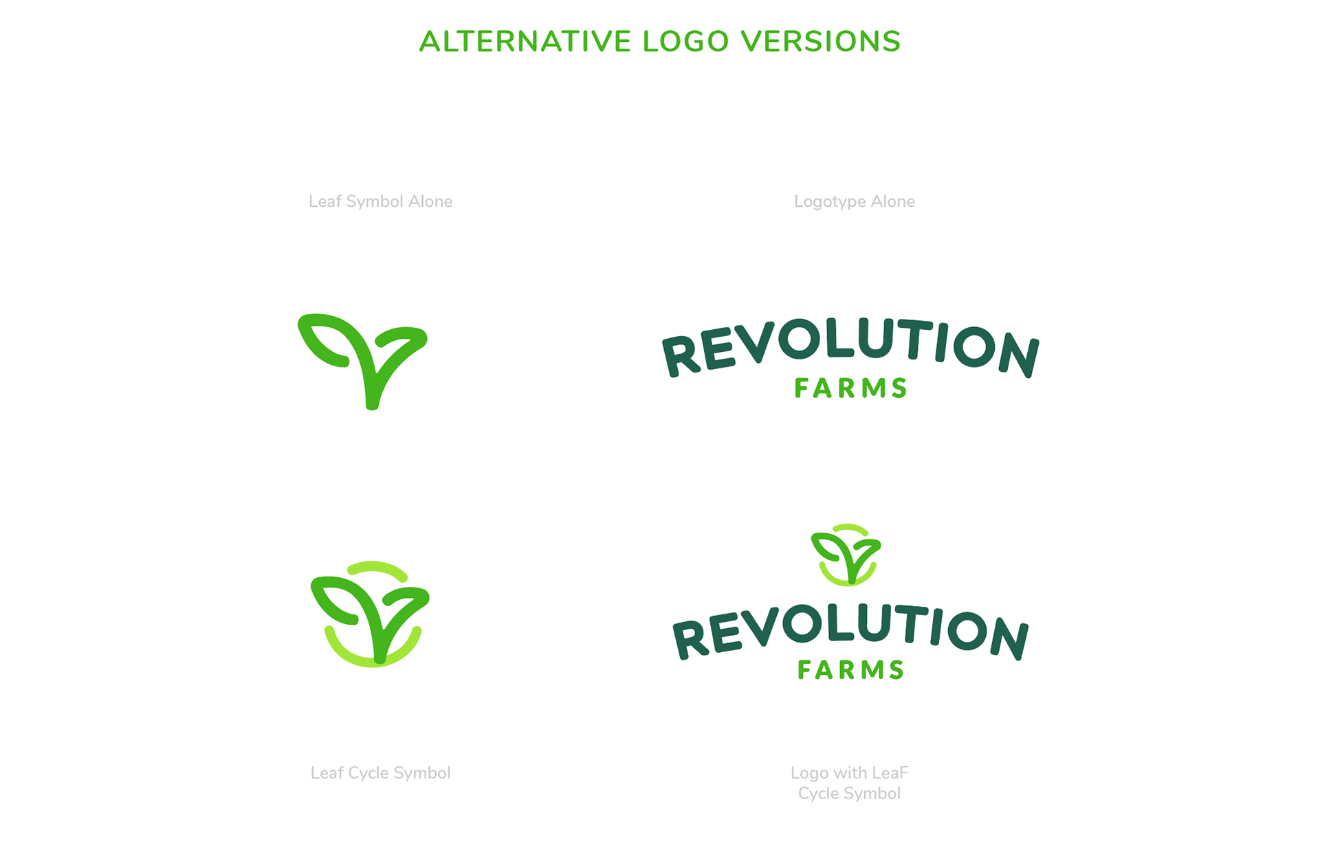
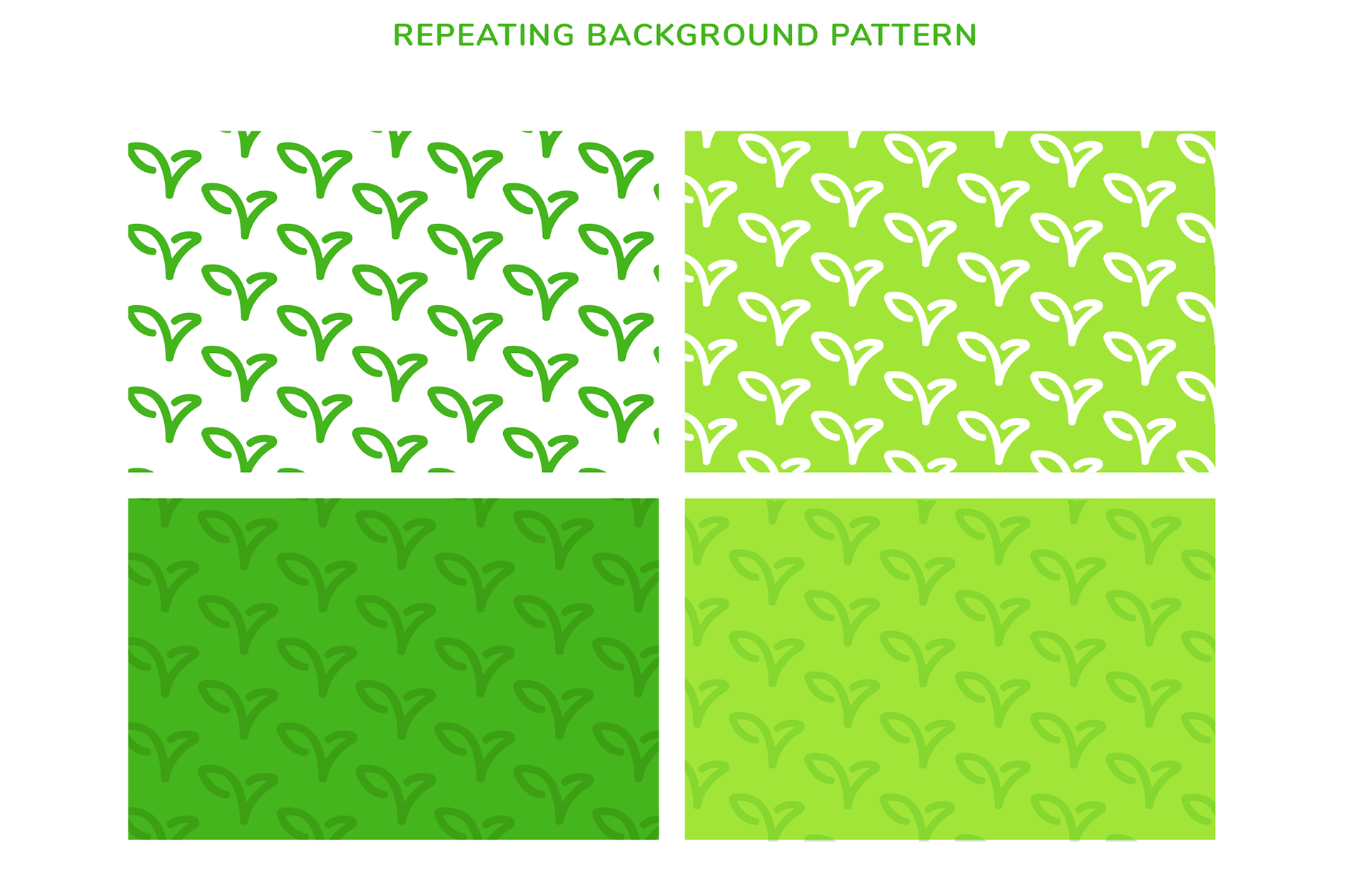
The end result yielded a graphic that was simple & easy to recognize with a somewhat hidden, dual interpretation of a fish and a leaf sprout.
The end result yielded a graphic that was simple & easy to recognize with a somewhat hidden, dual interpretation of a fish and a leaf sprout.
You can check out more ideation here.
_____________

______________
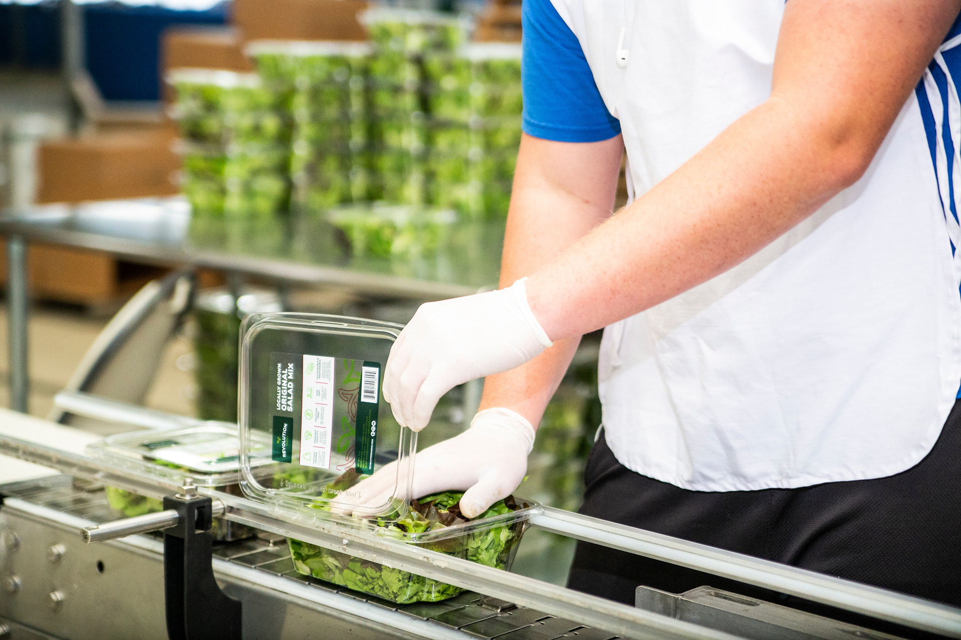
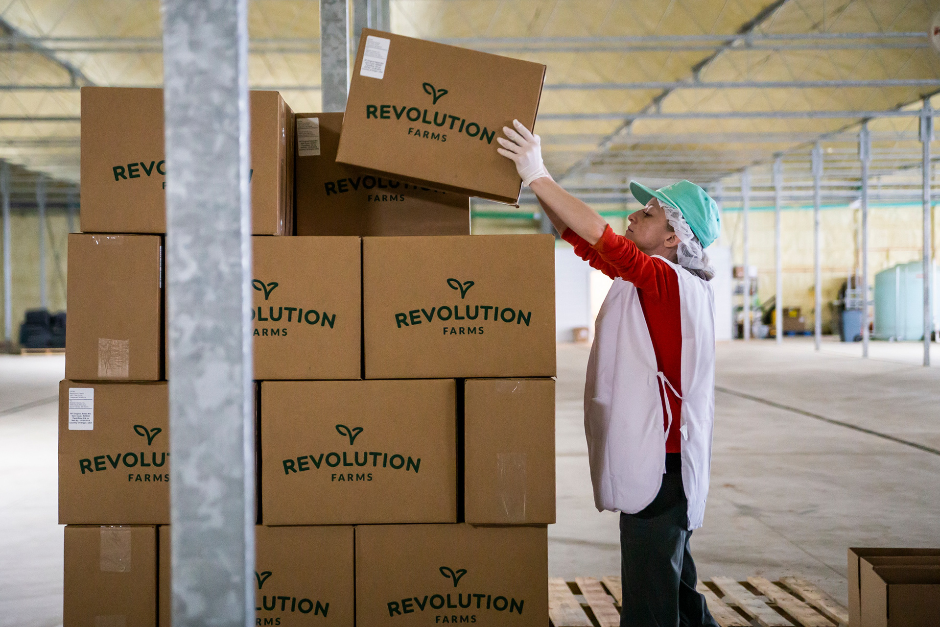
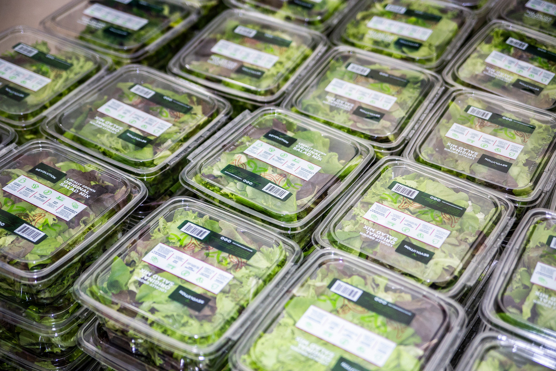
Application
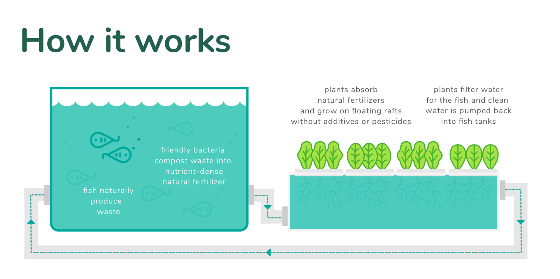
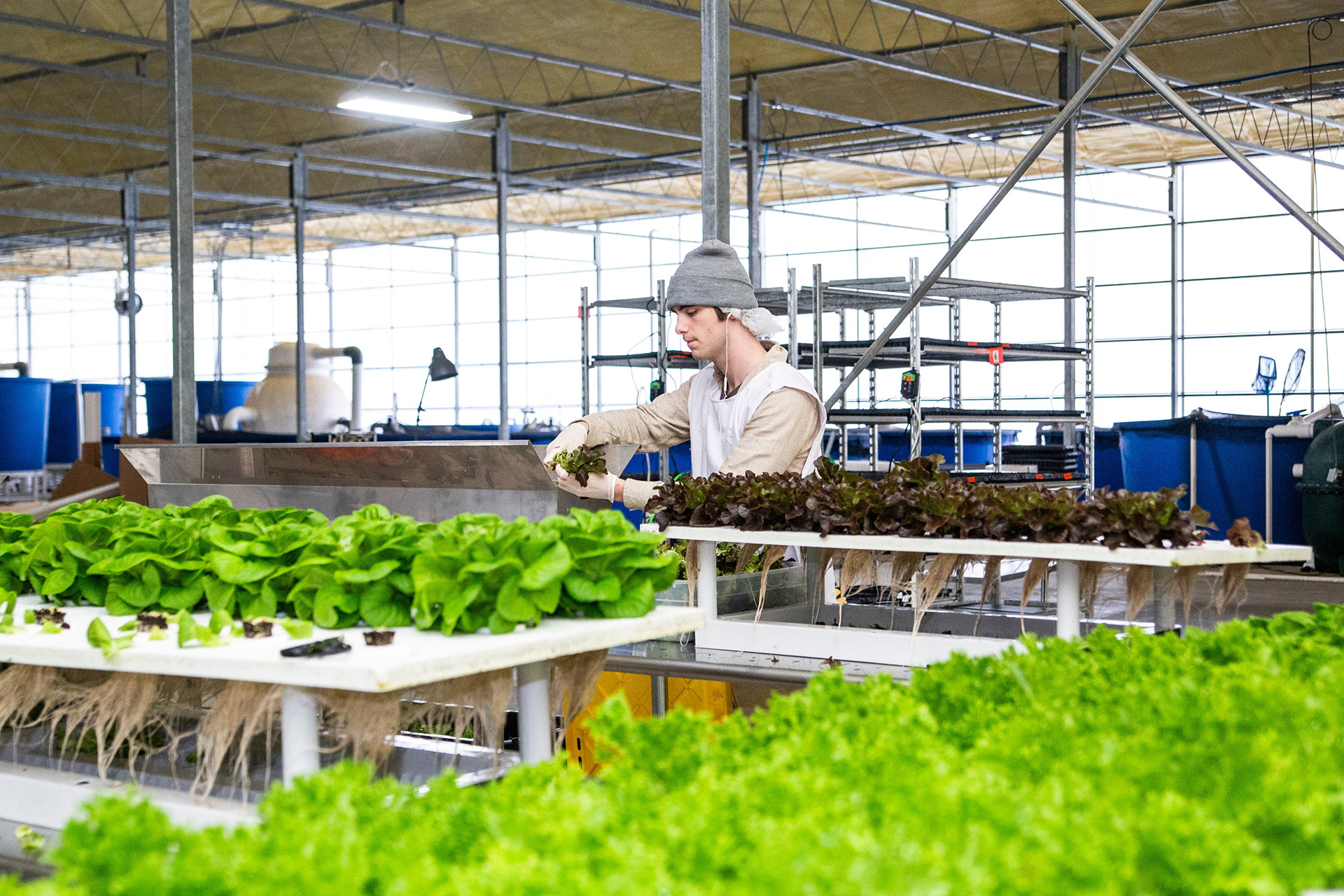
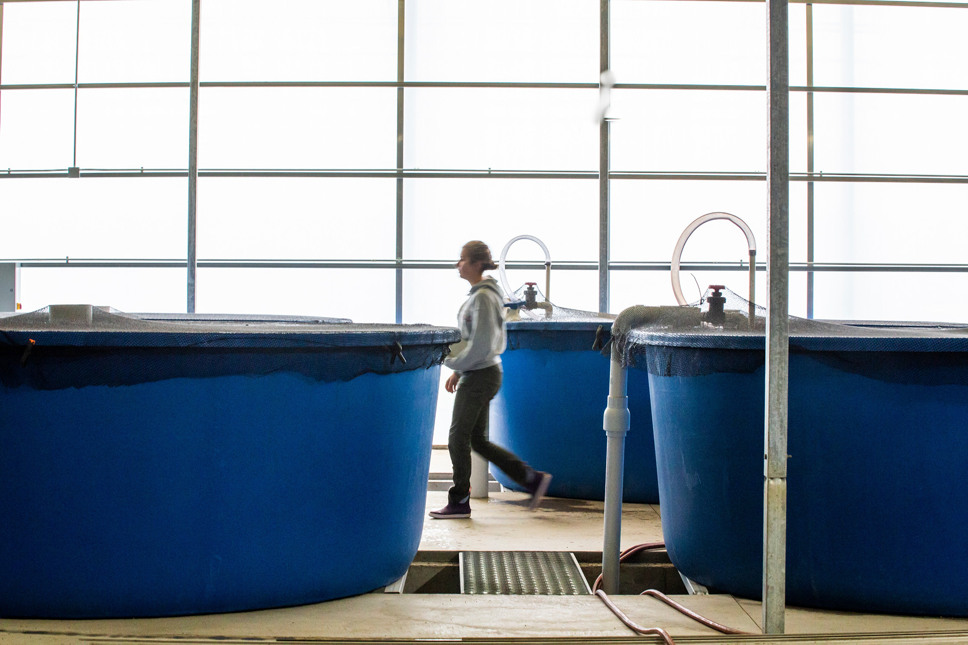
Once the Revolution Farms logo was finalized, more work was crafted for the brand as a whole,
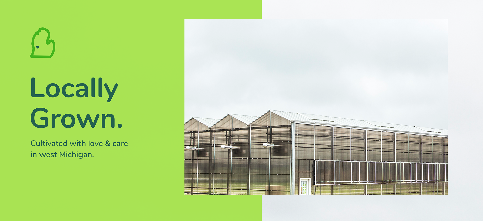
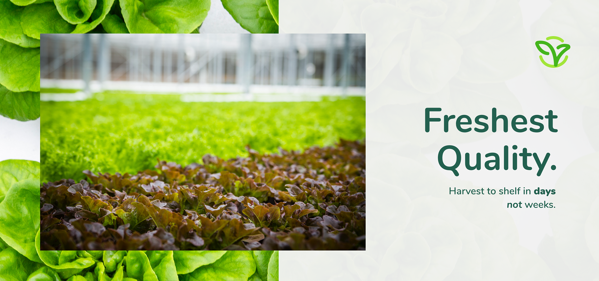
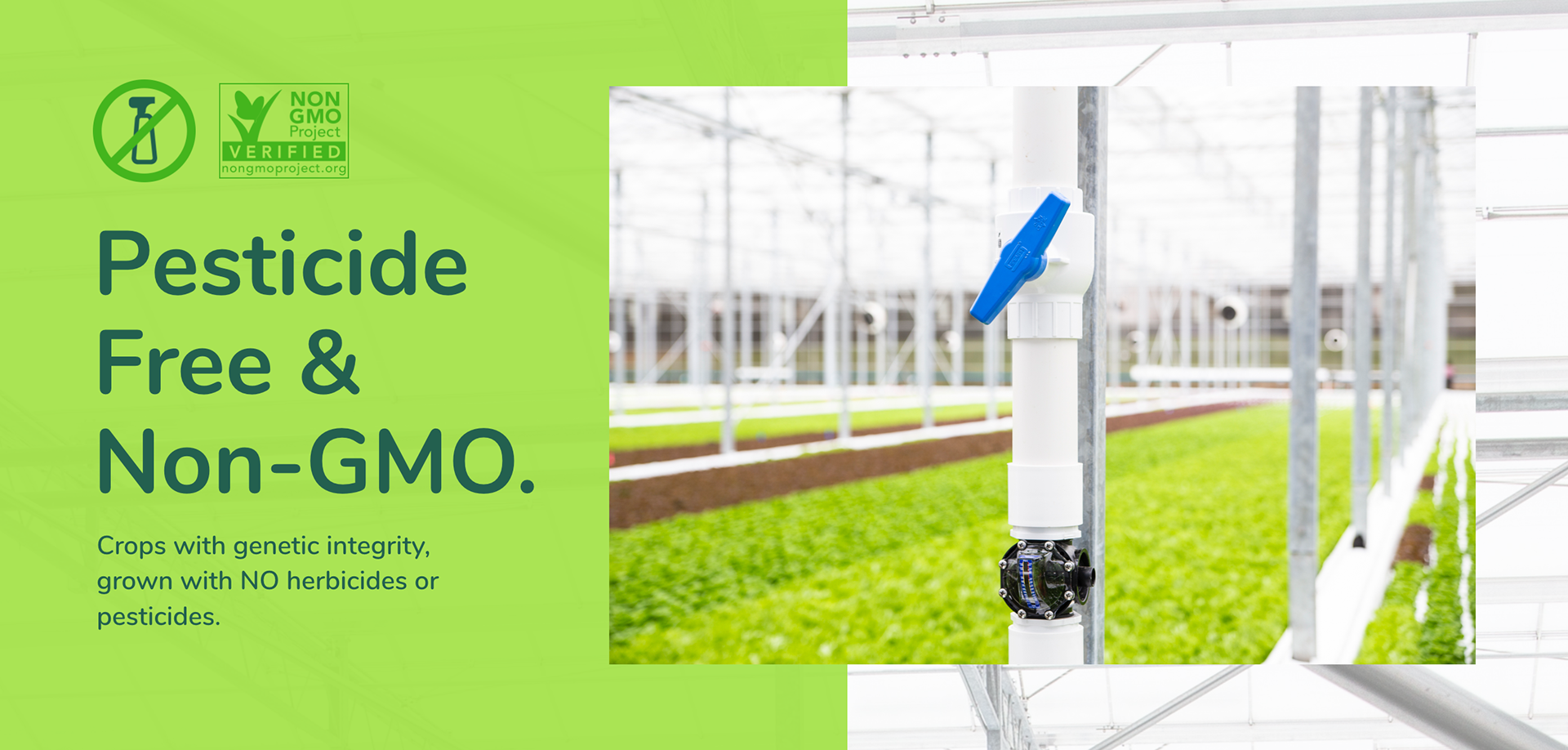
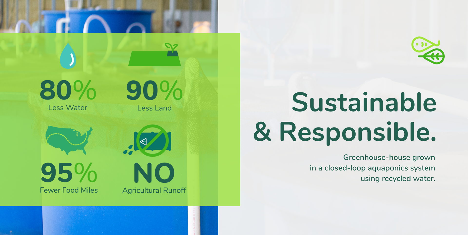
including illustrations to narrate the aquaponics process and advantages.
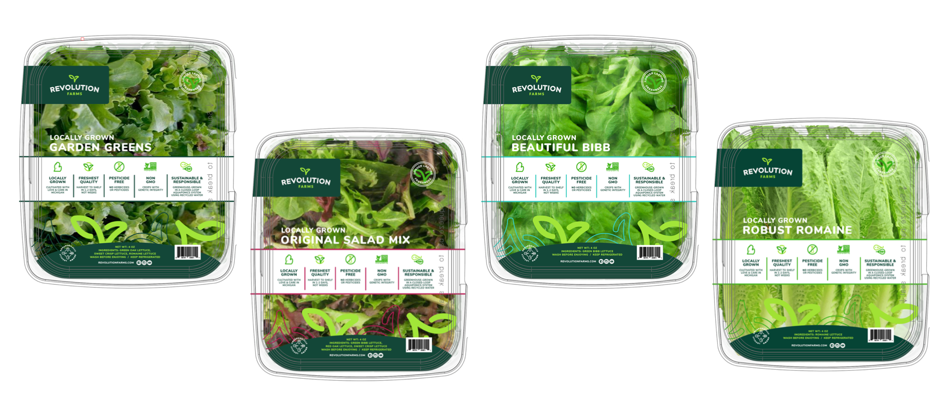
Following the brand guide, was application of the brand onto product packaging, sales tools and website.
including illustrations to narrate the aquaponics process and advantages.
Following the brand guide, was application of the brand onto product packaging, sales tools and website.

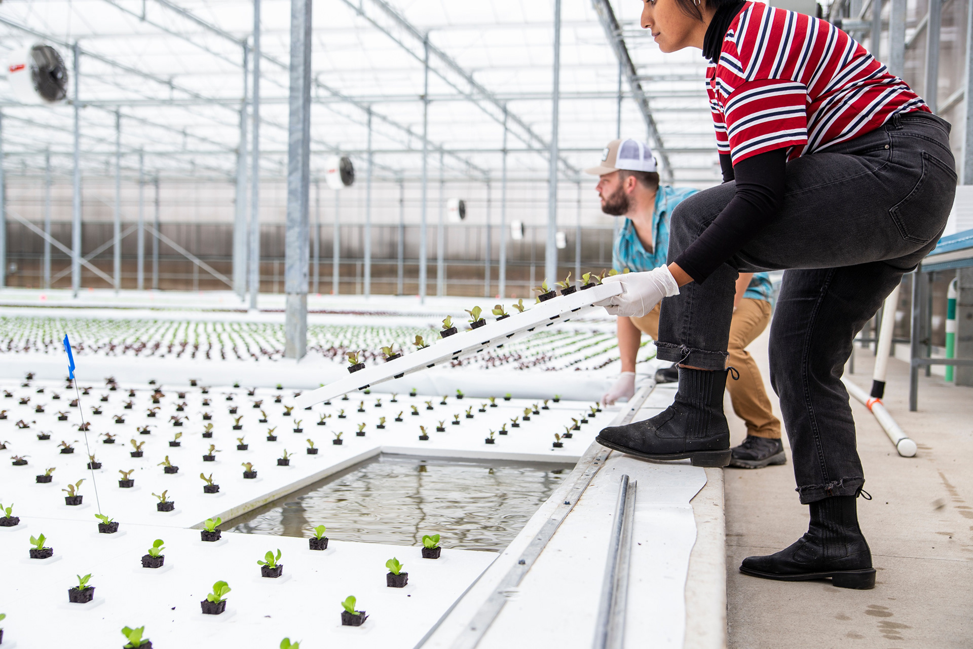
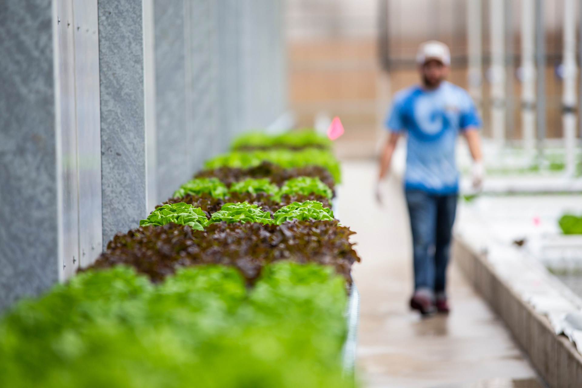
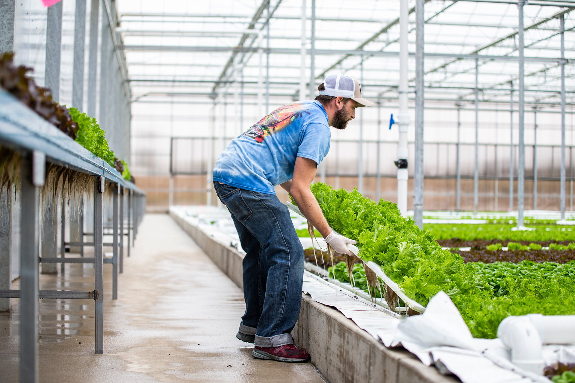
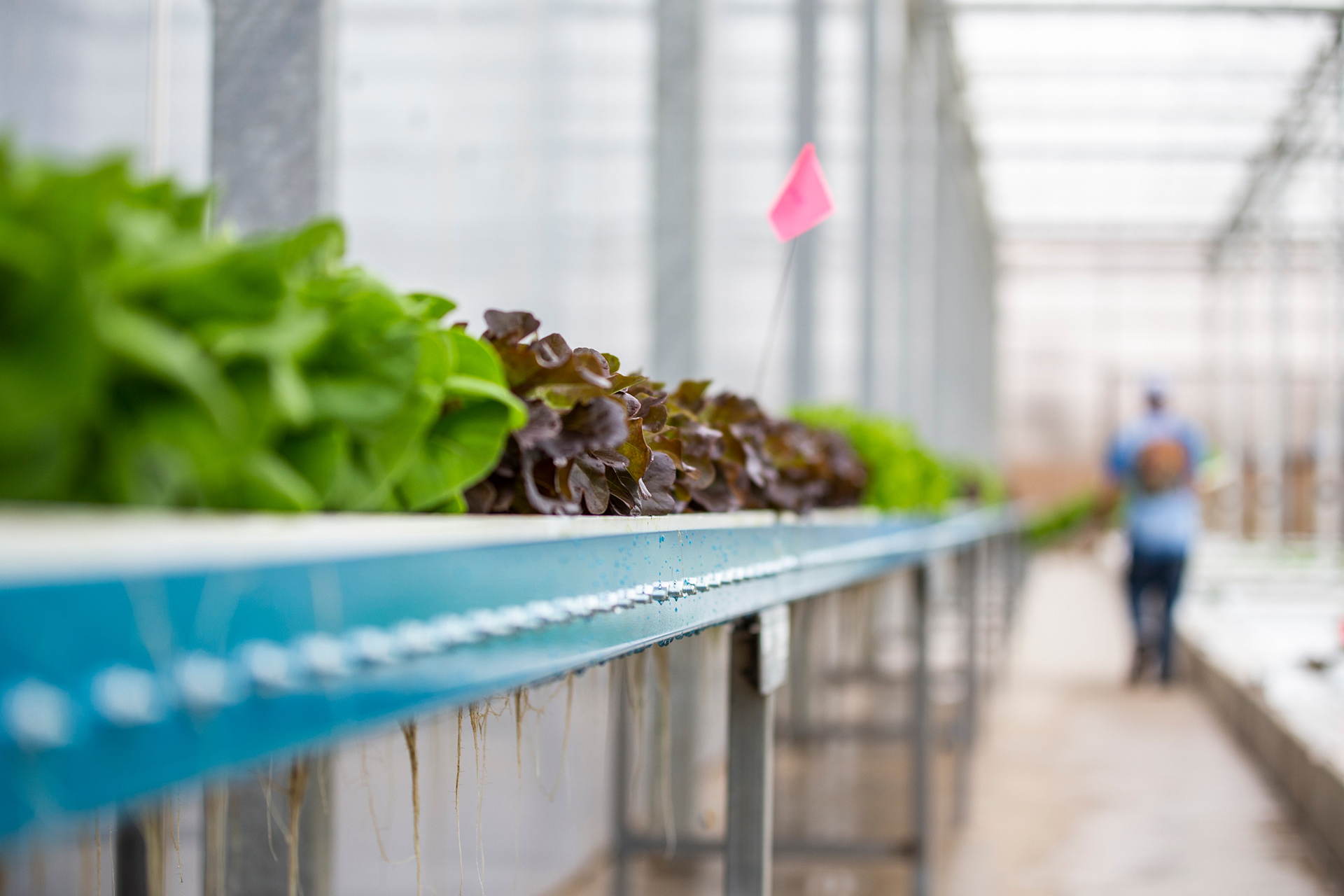
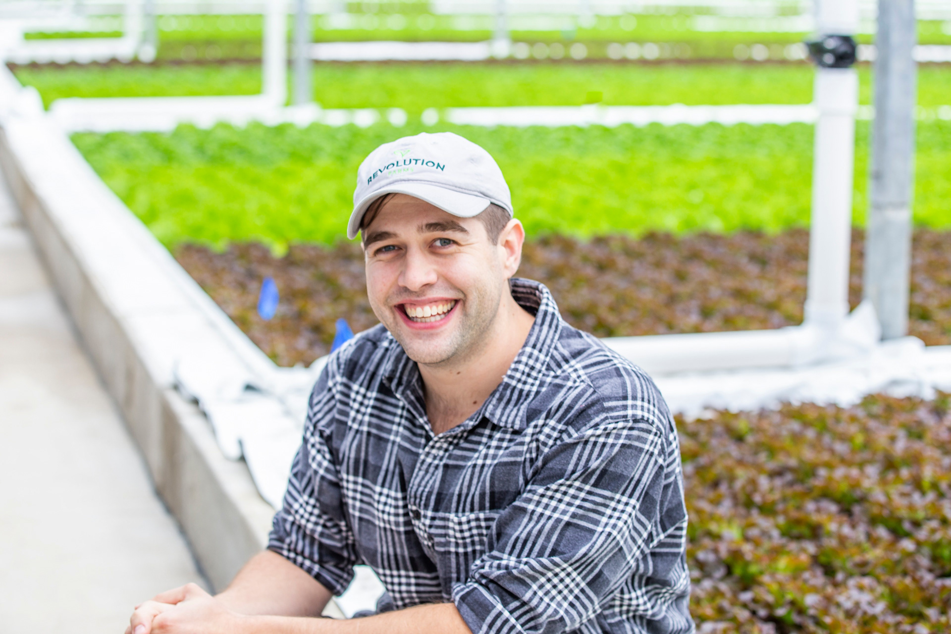
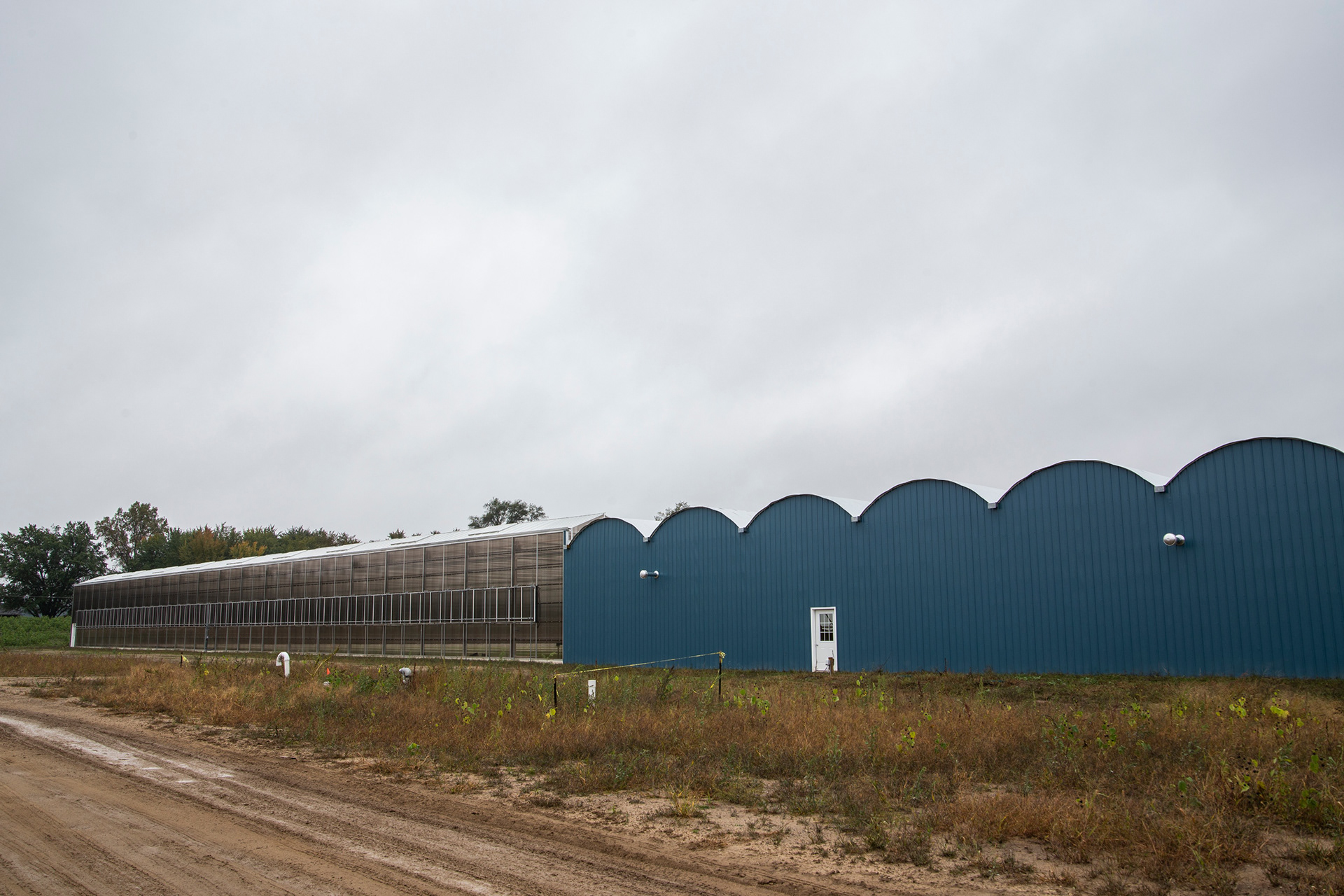
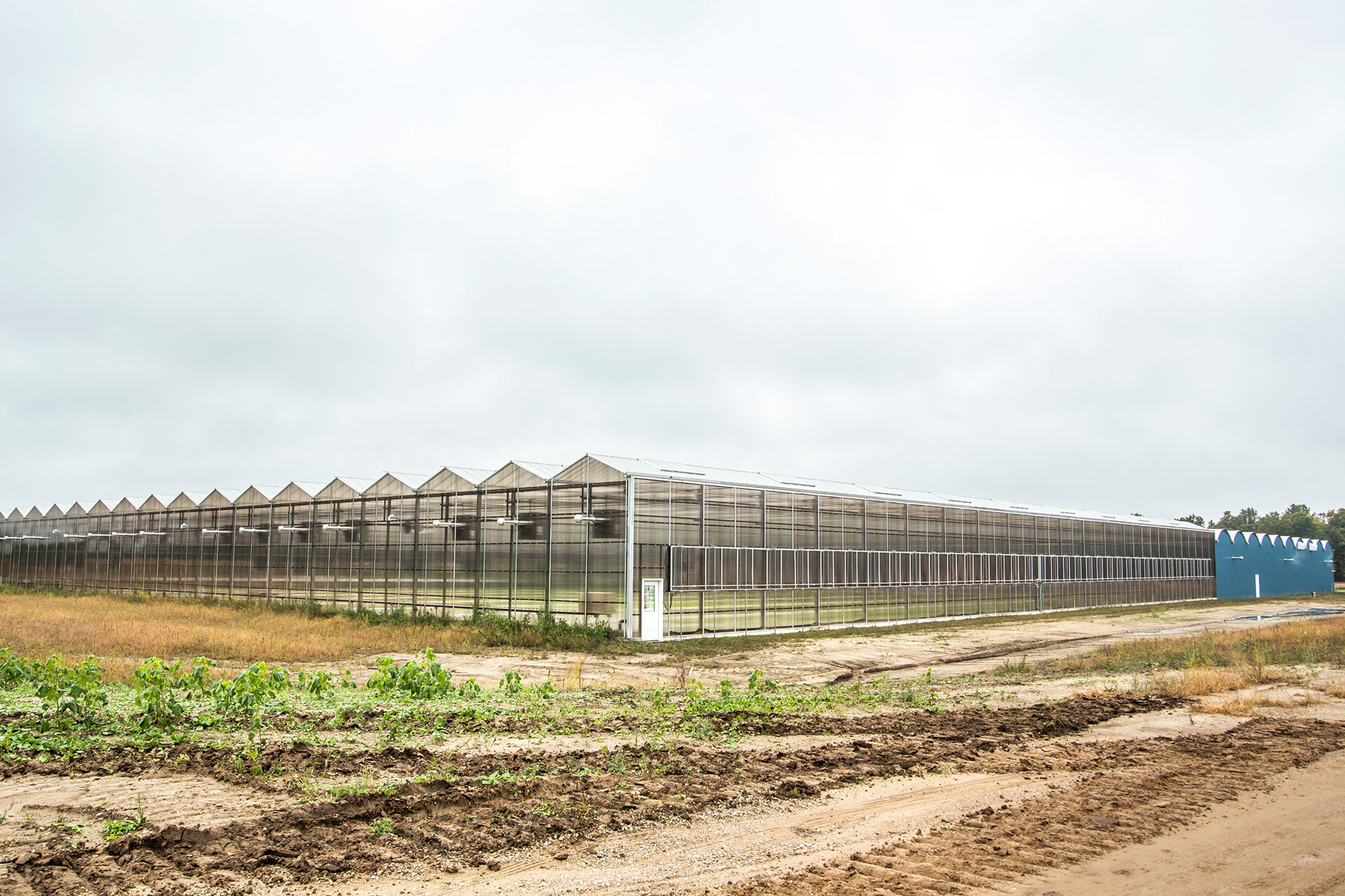
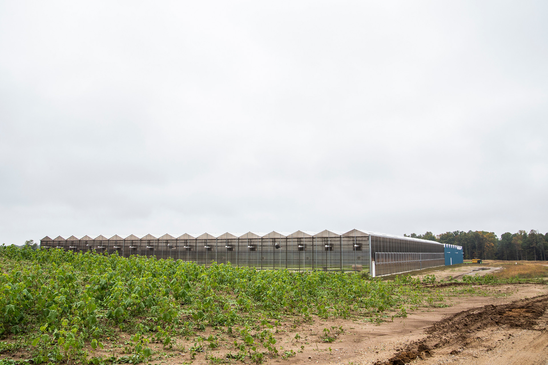
All original photography & design by Spencer Creative (Anthroflow), 2018.
See the full brand guide here.